Skip to content
English - United States
  • There are no suggestions because the search field is empty.

Lumion Cloud Navigation

Logos-masks-images-deep3.png


Purpose: for completions in documentation side 


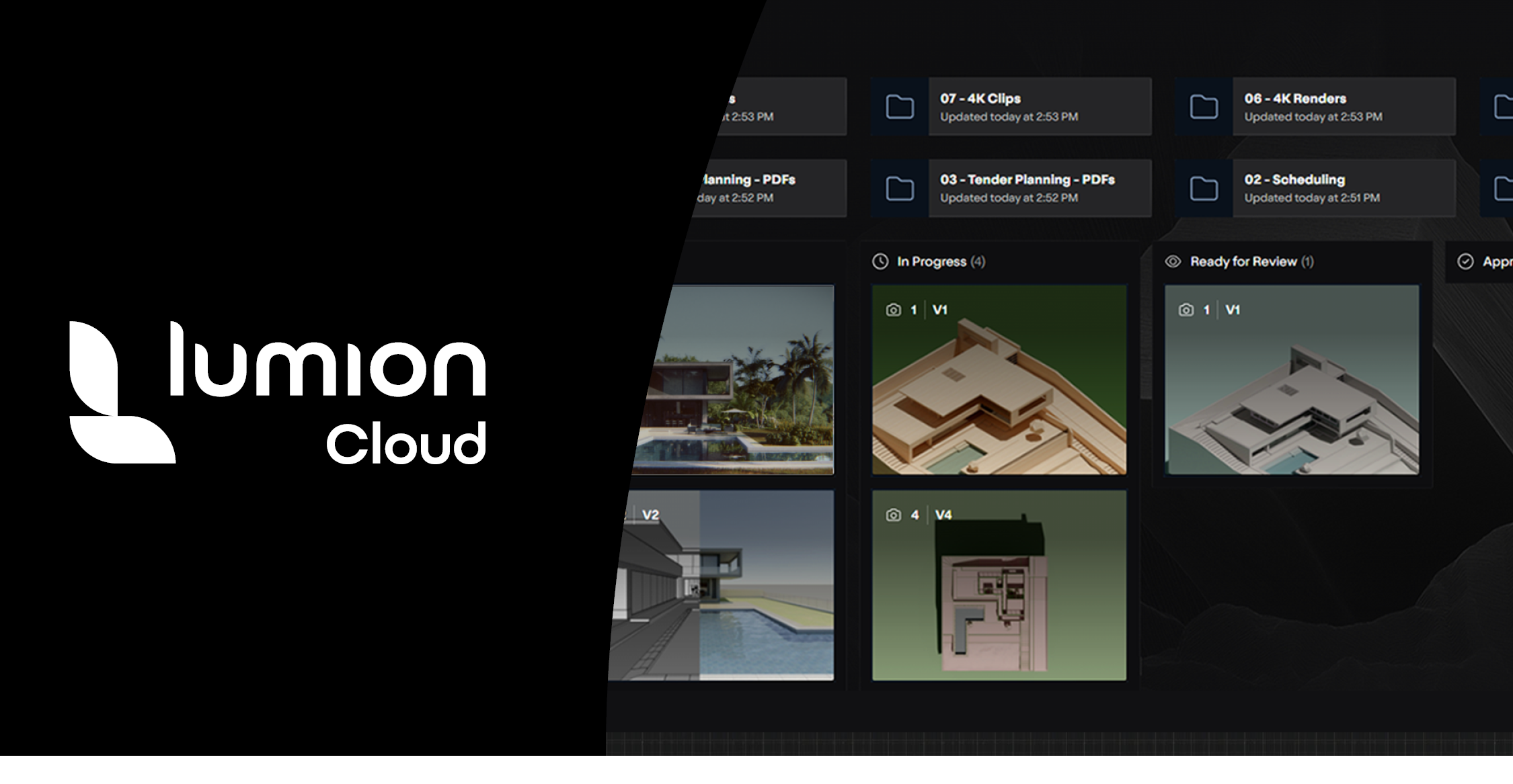
  1. Navigation module: The Header

Field
Description
Description
The header is a persistent, top-of-screen navigation and utility bar that adapts based on user authentication state. It provides access to search, notifications, user profile, and key navigation links, ensuring a consistent and branded experience across the product and the main website.
Purpose
To offer users quick access to essential navigation, account actions, and platform-wide search, while reinforcing brand identity and supporting a seamless transition between product and website.
User Problem
Users need a familiar, always-available way to navigate, search, and manage their account, regardless of where they are in the product or website.
Assumptions
The header is visible on all main product screens and the brand website; user authentication state is known; branding is consistent across all surfaces.
Not Doing
Deep customization per user, context-sensitive actions beyond navigation/search/account, or hiding the header on any main screen. Language selection is Out of scope.
Dependencies
Authentication service, user profile API, notification service, search API, brand assets.
Acceptance Criteria

Website – Logged In

Header with logo (home), search, navigation links, notification icon, user profile (account/settings/logout), language selector.


Website – Not Logged In

Header with logo (home), search, navigation links, login/sign up buttons, language selector.


In-App – Logged In

Header with logo (dashboard), search, navigation links, notification icon, user profile (account/settings/logout), language selector.


In-App – Not Logged In

Header with logo (login/landing), search (optional/limited), navigation links, login/sign up buttons, language selector.


  1. Navigation module: The Main Sidebar


Field
Description
Description
The sidebar is a persistent vertical navigation panel on the left side of the dashboard, providing quick access to main workspace areas, resources, and language selection.
Purpose
To enable fast, consistent navigation between core sections of the platform and access to support resources, improving user efficiency and orientation.
User Problem
Users need a reliable, always-visible way to switch between projects, renders, and resources without losing context or searching through menus.
Assumptions
Sidebar is visible on main product screen; navigation structure is consistent; user is authenticated for workspace access.
Not Doing
Context-sensitive or collapsible sidebar content, deep customization, or hiding the sidebar on main screens.
Dependencies
Navigation routing, user authentication, resource link management, language support.
Acceptance Criteria

My Workspace (Home, Projects, Renders)
Resources (Download, Community, Knowledge Base, Go to Lumion.com)

Language selector is present at the bottom

Active section is visually highlighted

Navigation links are always accessible


  1. Content module: The Project details sidebar

  2. IN PROJECTS ARTICLE, DO HERE AS SIMPLE LIST YOU CAN ACCESS


Field
Description
Description
The Project Details Sidebar is a persistent right-side panel that provides quick access to project information, attachments, member roles, activity, and storage usage, with tabs for overview and activity.
Purpose
To allow users to efficiently view and manage key project details, attachments, team roles, and storage without leaving the main project workspace.
User Problem
Users need to quickly reference or update project info, manage members, view attachments, and monitor storage while working on tasks.
Assumptions
Sidebar is visible when a project is open; user has permission to view/manage project details; project metadata is available.
Not Doing
Deep editing of project settings, advanced analytics, or hiding the sidebar.
Dependencies

Project API, user and role management, attachment/file storage, activity tracking, storage monitoring.


Acceptance Criteria

Sidebar is visible on the right when a project is open

Tabs for “Overview” and “Activity” are present

Project name and description (with show more/edit) are displayed

Attachments section shows thumbnails and “show more” link

Members section lists all members with roles and email addresses

“Invite user” button is present

Storage usage bar shows used and total storage


  1. Content module: The Render view Sidebar

  2. IN RENDER ARTICLE, DO HERE AS SIMPLE LIST YOU CAN ACCESS


Field
Description
Description
The Render View Sidebar is a right-side panel that provides access to comments, details, and activity related to the currently viewed render. It includes tabs for switching between these sections and supports threaded discussions, with each comment card displaying a unique number and timestamp for traceability.
Purpose
To enable users to efficiently review, discuss, and track feedback, details, and changes associated with a specific render, all without leaving the main viewing area.
User Problem
Users need to collaborate, leave precise feedback, and monitor activity on renders in a centralized, easily accessible location.
Assumptions
Sidebar is visible when a render is open; user has permission to view/comment; render metadata and activity logs are available.
Not Doing
Advanced analytics, tagging/mention users (oos)
Dependencies

Commenting and activity APIs, user management, render metadata, UI for threaded comments and activity feed.


Acceptance Criteria

Sidebar is visible on the right when a render is open

Tabs for “Comments,” “Details,” and “Activity” are present

Comments section displays threaded comments with user icons and timestamps

Comment input field is available at the bottom

Details tab shows render-specific metadata

Activity tab lists recent actions and changes related to the render